Matplotlib 绘图
Matplotlib 提供非常全面的数据可视化功能。
安装
非常简单,直接 执行 pip install matplotlib 即可
简单示例
下面的代码,运行一下看看
import matplotlib.pyplot as plt

# 如果只传入一个数组作为参数, matplotlib 认为是 Y 轴的坐标
# 并自动产生 从 0 开始的 对应 X 轴坐标: 0、1、2、3 ...
plt.plot([2, 4, 6, 8])
plt.ylabel('some numbers')
plt.show()
当然,我们也经常需要 同时指定 作图点的 X 坐标 和 Y 坐标
import matplotlib.pyplot as plt

# 绘图点的 X 轴 坐标依次为 1, 3, 5, 7
# 绘图点的 Y 轴 坐标依次为 2, 4, 6, 8
plt.plot([1, 3, 5, 7], [2, 4, 6, 8])
plt.ylabel('some numbers')
plt.show()
可以在一幅图上,画多组数据,如下所示
import matplotlib.pyplot as plt

# 画一组数据
plt.plot([1, 2, 3, 4], [1, 4, 9, 16])
# 再画一组数据
plt.plot([1, 2, 3, 4], [1, 3, 5, 8])
plt.show()
显示中文字符
matplotlib的缺省字体不支持中文,我们可以指定一个支持中文的字体
import matplotlib.pyplot as plt

plt.rcParams['font.family'] = 'sans-serif'
# 设定字体为微软雅黑
plt.rcParams['font.sans-serif']=['Microsoft Yahei']

plt.plot([1, 2, 3, 4])
plt.xlabel('times 次数')
plt.show()
显示格式
给定了xy坐标作为 plot 的前两个参数, 还可以有可选的第三个参数,表示数据绘制的风格,缺省值为 b- 。
b 表示 蓝色, - 表示 是线图。
如果想显示红色点图,就是 风格参数 r. , r 代表红色, . 代表点, 如下
import matplotlib.pyplot as plt

plt.plot([1, 2, 3, 4], [1, 4, 9, 16], 'r.')
plt.show()
完整的 风格参数定义,点击这里参考官方文档
指定宽度
我们可以 使用参数 linewidth 指定绘图的线条宽度
import matplotlib.pyplot as plt

plt.plot(range(10), range(10), linewidth=0.5)
plt.show()
我们可以 使用参数 markersize 指定点的大小
import matplotlib.pyplot as plt

plt.plot(range(10), range(10), 'r.', markersize=2.5)
plt.show()
numpy 数组
其实 matplotlib 内部都是把作图数据转化为 numpy 的 ndarray 数组类型进行处理的。
所以,我们当然可以,直接使用 numpy 的数组作为 画图数据
import matplotlib.pyplot as plt
import numpy as np

# arange 就像 Python中的range
# 从 0 到 5 步长为 0.2
t = np.arange(0, 5, 0.2)

# 使用 numpy 的ndarray 作为数据
plt.plot(t, t**2, 'b.')
plt.show()
柱状图
使用 bar 方法可以画柱状图
import matplotlib.pyplot as plt

names = ['2016', '2017', '2018']
values = [1, 10, 100]

plt.bar(names, values)
plt.show()
饼图
import matplotlib.pyplot as plt

# 指定饼图的每个切片名称
labels = 'Frogs', 'Hogs', 'Dogs', 'Logs'

# 指定每个切片的数值,从而决定了百分比
sizes = [15, 30, 45, 10]
explode = (0, 0.1, 0, 0)  # only "explode" the 2nd slice (i.e. 'Hogs')

fig1, ax1 = plt.subplots()
ax1.pie(sizes, explode=explode, labels=labels, autopct='%1.1f%%',
        shadow=True, startangle=90)
ax1.axis('equal')  # Equal aspect ratio ensures that pie is drawn as a circle.

plt.show()
散点图
使用 scatter 方法可以画散点图
import matplotlib.pyplot as plt

names = ['2016', '2017', '2018', '2019', '2020']
values = [75, 78, 100, 150, 210]

plt.scatter(names, values)
plt.show()
多个子图(axes)
subplot 方法可以用来创建多个子图(axes)。
前面的示例中,我们并没有创建子图,其实, matplotlib缺省会帮我们调用 plt.subplot(1,1,1) 指定 1行,1列,共1个子图,当前子图为第1个.
如果你想指定更多的子图,可以这样,
import matplotlib.pyplot as plt
import numpy as np
# arange 就像 Python中的range
# 从 0 到 5 步长为 0.2
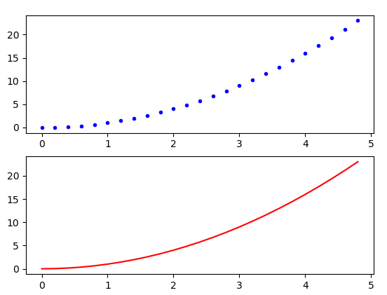
t = np.arange(0, 5, 0.2)
# 指定2行,1列,共两个axe,当前使用第1个绘图块
plt.subplot(2,1,1)
plt.plot(t, t**2, 'b.')
# 当前使用第2个绘图块
plt.subplot(2,1,2)
plt.plot(t, t**2, 'r-')
plt.show()
结果如下:
多个绘图(Figure)
matplotlib 每个绘图区都对应一个 Figure 对象。
一个绘图 Figure 对象 里面可以包含多个 subplot对象。
而我们的程序可以同时打开多个绘图 Figure 对象。
比如下图,你可以发现有两个绘图窗口,对应两个 Figure 对象
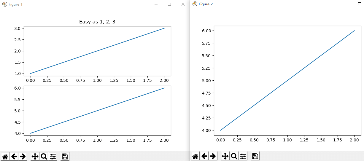
前面的示例中,我们并没有声明创建Figure对象,其实是默认使用了 matplotlib 缺省Figure 对象。
默认Figure ,也就是相当于调用 plt.figure(1) 指定第一个绘图。
我们可以像下面这样创建多个Figure
import matplotlib.pyplot as plt
plt.figure(1)                # the first figure
plt.subplot(211)             # the first subplot in the first figure
plt.plot([1, 2, 3])
plt.subplot(212)             # the second subplot in the first figure
plt.plot([4, 5, 6])


plt.figure(2)                # a second figure
plt.plot([4, 5, 6])          # creates a subplot(111) by default

plt.figure(1)                # figure 1 current; subplot(212) still current
plt.subplot(211)             # make subplot(211) in figure1 current
plt.title('Easy as 1, 2, 3') # subplot 211 title

plt.show()
运行代码,就可以产生上面的图形。
图形中的文字
import matplotlib.pyplot as plt
import numpy as np

mu, sigma = 100, 15
x = mu + sigma * np.random.randn(10000)

n, bins, patches = plt.hist(x, 50, density=1, facecolor='g', alpha=0.75)

# x轴标题
plt.xlabel('Smarts')
# y轴标题
plt.ylabel('Probability')
# 子图标题
plt.title('Histogram of IQ')
# 指定坐标处添加文本
plt.text(60, .025, r'$\mu=100,\ \sigma=15$')
plt.axis([40, 160, 0, 0.03])
plt.grid(True)
plt.show()
结果如下:

我们可以像这样,指定标题的颜色
t = plt.xlabel('my data', fontsize=14, color='red')
x轴刻度文字垂直
有时候我们作图时,x轴文字内容比较长,会出现重叠,这时需要x轴刻度文字垂直,可以如下设置
import matplotlib.pyplot as plt
# 设定字体为微软雅黑
plt.rcParams['font.family'] = 'Microsoft Yahei'

# x刻度垂直,否则字会重叠
plt.xticks(rotation=-90)

# 加长底部空间,否则文字显示不全
plt.subplots_adjust(bottom=0.45)
X轴坐标定制
有时候,我希望 matplotlib绘图内容,X轴坐标为定制内容,不是固定的数字
可以如下示例代码:
import matplotlib
import matplotlib.pyplot as plt


plt.rcParams['font.family'] = 'sans-serif'
# 设定字体为微软雅黑
plt.rcParams['font.sans-serif']=['Microsoft Yahei']

x = [0,1,2]
y = [90,40,65]
plt.plot(x,y, 'r')

# 重新设定 x坐标
labels = ['1月', '2月', '3月']
plt.xticks(x, labels, rotation='vertical')

plt.show()
嵌入Qt中
有时候,我希望Qt程序界面中包含 matplotlib绘图内容,怎么把 matplotlib绘图嵌入Qt中 呢?
就像这样
示例图对应代码这里下载
链接:https://pan.baidu.com/s/1S_FEOlMnlQrjYiB6vUhyyw 提取码:byhy
本节内容的视频讲解 在老师发你的 实战班内部补充学习视频网盘 里的 matplotlib嵌入qt 目录中。
嵌入 matplotlib 的绘图到Qt的关键就是 使用 FigureCanvasQTAgg 这 QWidget 的子类。
对外,Qt可以把它当做其他QWidget对象一样存放在界面中
对内,里面 内置matplotlib的绘图对象
所以,只要 创建FigureCanvasQTAgg 对象,并且 把 FigureCanvasQTAgg 对象放入Qt窗口中即可。
示例代码如下:
from PySide2 import  QtWidgets

from matplotlib.backends.backend_qt5agg import FigureCanvasQTAgg
from matplotlib.figure import Figure


# 创建一个继承自FigureCanvasQTAgg的类
# 也就是一个 QWidget 的子类
class MplCanvas(FigureCanvasQTAgg):

    def __init__(self, parent=None, width=5, height=4, dpi=100):
        fig = Figure(figsize=(width, height), dpi=dpi)
        self.axes = fig.add_subplot(111)
        # 一定要把Figure对象作为参数传递进去
        super().__init__(fig)


class MainWindow(QtWidgets.QMainWindow):

    def __init__(self, *args, **kwargs):
        super(MainWindow, self).__init__(*args, **kwargs)

        sc = MplCanvas(self, width=5, height=4, dpi=100)
        sc.axes.plot([0, 1, 2, 3, 4], [10, 1, 20, 3, 40])

        # 把 matplotlib 的 FigureCanvasQTAgg 对象放入Qt窗口中
        self.setCentralWidget(sc)

        self.show()


app = QtWidgets.QApplication([])
w = MainWindow()
app.exec_()
如果我们想把 matplotlib 的工具栏也显示出来,可以使用 matplotlib 库里面的 NavigationToolbar2QT 类,
像这样
from PySide2 import QtWidgets

from matplotlib.backends.backend_qt5agg import FigureCanvasQTAgg, NavigationToolbar2QT
from matplotlib.figure import Figure


class MplCanvas(FigureCanvasQTAgg):

    def __init__(self, parent=None, width=5, height=4, dpi=100):
        fig = Figure(figsize=(width, height), dpi=dpi)
        self.axes = fig.add_subplot(111)
        super().__init__(fig)


class MainWindow(QtWidgets.QMainWindow):

    def __init__(self, *args, **kwargs):
        super(MainWindow, self).__init__(*args, **kwargs)

        sc = MplCanvas(self, width=5, height=4, dpi=100)
        sc.axes.plot([0,1,2,3,4], [10,1,20,3,40])

        # 创建工具栏对象, 以 MplCanvas对象 和 父窗口对象作为参数
        toolbar = NavigationToolbar2QT(sc, self)

        layout = QtWidgets.QVBoxLayout()
        layout.addWidget(toolbar)
        layout.addWidget(sc)

        # 创建一个上层控件对象存放 Layout
        widget = QtWidgets.QWidget()
        widget.setLayout(layout)
        self.setCentralWidget(widget)

        self.show()


app = QtWidgets.QApplication([])
w = MainWindow()
app.exec_()
可以把 matplotLib图表 和 Qt其它控件 结合在一个界面中,并且设置好图表操作事件的处理,像下面这样
from PySide2.QtWidgets import QWidget, QPushButton, QLineEdit,\
                             QHBoxLayout, QVBoxLayout, QApplication

from matplotlib.backends.backend_qt5agg import FigureCanvasQTAgg
from matplotlib.figure import Figure

class MplCanvas(FigureCanvasQTAgg):

    def __init__(self, parent=None, width=5, height=4, dpi=100):
        fig = Figure(figsize=(width, height), dpi=dpi)
        self.axes = fig.add_subplot(111)
        super().__init__(fig)
        self.fig = fig

    def setEventHandler(self,eventtype,handler):
        self.fig.canvas.mpl_connect(eventtype, handler)

class Example(QWidget):

    def __init__(self):
        super().__init__()
        self.initUI()

    def initUI(self):

        okButton = QPushButton("OK")
        cancelButton = QPushButton("Cancel")
        lineEdit = QLineEdit('点击信息')
        self.lineEdit = lineEdit

        # 水平layout里面放两个button
        hbox = QHBoxLayout()
        hbox.addWidget(lineEdit)
        hbox.addWidget(cancelButton)
        hbox.addWidget(okButton)

        # 垂直layout里面放 matplotLib图表 和 前面的水平layout
        sc = MplCanvas(self, width=5, height=4, dpi=100)
        sc.axes.plot([0, 1, 2, 3, 4], [10, 1, 20, 3, 40])

        vbox = QVBoxLayout()
        vbox.addWidget(sc)
        vbox.addLayout(hbox)

        # 设置全局layout
        self.setLayout(vbox)

        # 设置消息处理
        sc.setEventHandler('button_press_event',self.onClick)

        self.setGeometry(300, 200, 800, 450)
        self.setWindowTitle('matplotLib 示例')
        self.show()

    # 在图表上点击,编辑框中会显示点击的鼠标键和坐标信息
    def onClick(self,event):
        info = '%s click: button=%d, x=%d, y=%d, xdata=%f, ydata=%f' % \
          ('double' if event.dblclick else 'single', event.button,
           event.x, event.y, event.xdata, event.ydata)

        self.lineEdit.setText(info)

app = QApplication([])
ex = Example()
app.exec_()
如果我们在一个通过加载界面资源文件产生界面的代码上,加入 matplotlib 绘图, 该怎么做呢?
做法和前面一样。
只是我们要先通过qt设计师 在ui文件里面 加上一个layout用来存放 matplotlib 绘图控件。
然后在代码中的做法就是通过这个 layout 的 addWidget() 方法加入 matplotlib 绘图控件。
具体看对应的视频讲解。